Kalorie Trak Mobile App Redesign Project
To redesign a mobile app's home and journal screens, I first created user personas and established the task flow and user flow of the design alongside three other designers.

These personas allowed for a deeper understanding of the kinds of people we would be designing for.

The task and user flows help explain the process that the app should go through in order to create a coherent experience. They also help describe the process a user goes through in order to complete the task the app is made for.
After understanding the audience for the app and the steps the app takes to accomplish its tasks, I created sketches for the app's home and journal screens.
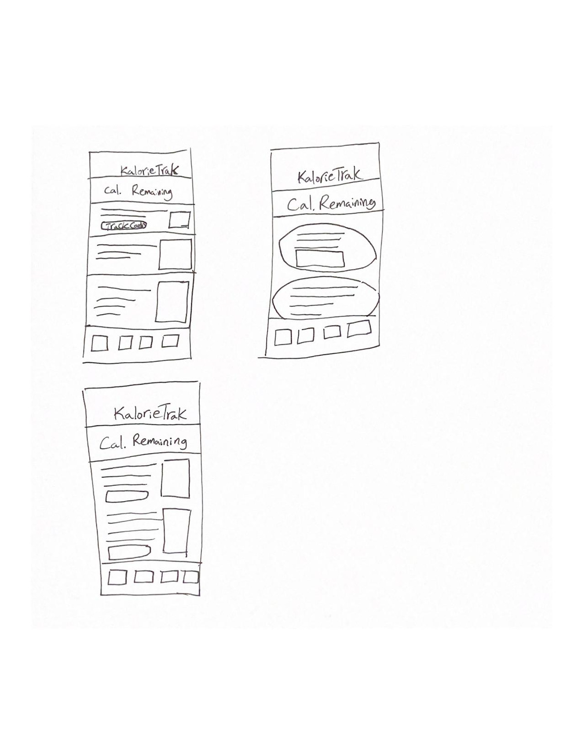

Next, I created a wireframe, one for each screen, on Figma in order to put these sketches into a digital format and realize the concepts I wanted to use for the design.

I really like the original design's use of a light blue to accent the whites and greys that dominate the screen.

The final iteration on the home page. I decided to try a darker main theme and combine it with the same light blue for contrast. I also kept the concept of the home page being mainly concept-based, using video and pictures to show off the other features of the app and the community Kalorie Trak has created. I also decided to give more focus to the navigation bar by taking out the plus button, and letting the contrast colors give more attention to the bottom icons.

The final iteration of the diary page, where one can record the calories they've taken, or used, within a day. I received feedback from other designers that the previous iterations lacked visual clarity or interest, and more icons was often suggested. I decided to add icons to each section of calories, as well as giving them the contrast color. The calorie tracker meter at the top was also made smaller to have it be present but not overpowering compared to the other statistics the user would be scanning and entering.
Conclusion
The revisions given to the Kalorie Trak app allow for a more direct and succinct experience for the user. A greater use of icons and more contrast between elements allows for a quicker experience overall, where the user may scan each screen to find wanted information instead of guessing or taking time reading unwanted sections of the page. Creating user personas with others before beginning the design process allowed me to understand what a user would be looking for and expecting. Users often come into an app process with previous frustrations, so it becomes important to anticipate the many preferences and pressure points a user brings.

